
Warm Colors are Trending
June 14, 2018
Crisp, sophisticated whites, grays, and indigos have dominated interior design trends in the last few years. While these combinations never go out of style, warm colors are making their way into Charleston interiors. Driven by the popularity of blush pinks and rose gold, we’re seeing the addition of toasty mustards, deeper shades of rose, terra cotta, rust, and even salmon (a perennial Charleston favorite).
How to Embrace Warm Tones with Charleston Style
One of the reasons cool colors are so popular in Charleston interiors is visually cool interiors are refreshing in the Lowcountry heat. You can keep your interiors visually cool and still embrace the gorgeous spicy colors. And, if you love your dove gray walls (and who doesn’t?), there’s no reason to repaint.
Bring warmer tones into your spaces through fabrics, accessories, or window treatments.
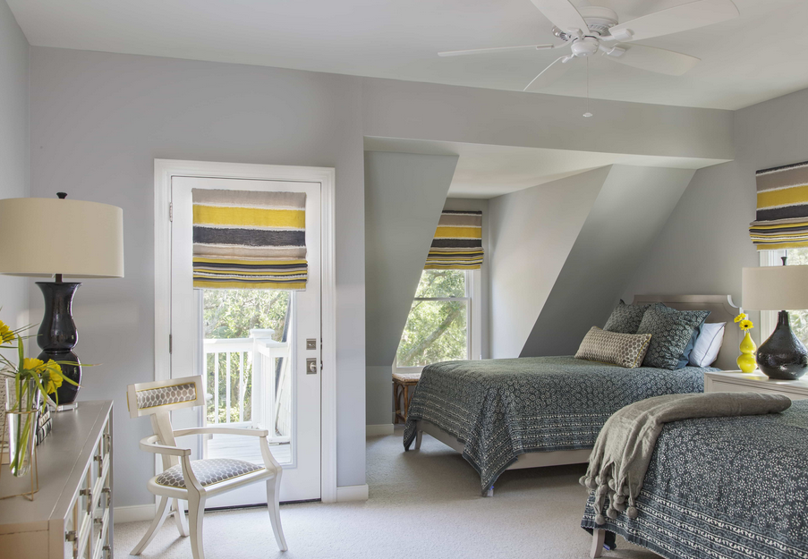
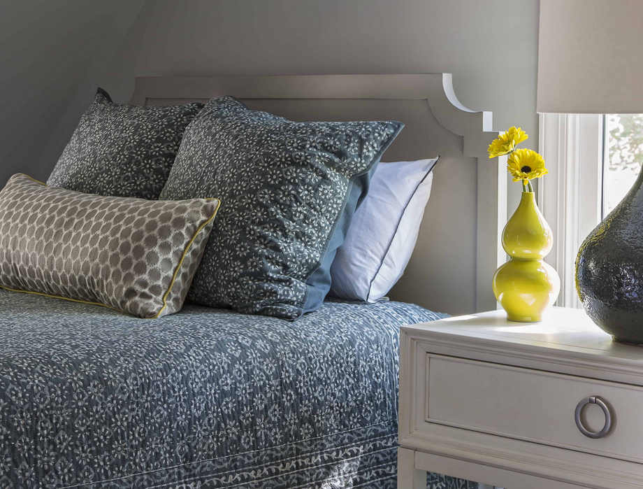
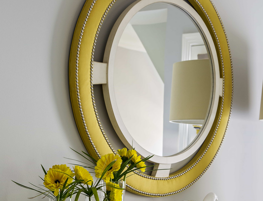
Yellow
Yellow tones that range from buttercup to a more exotic mustard look fantastic against white and gray. Combine yellow accessories with your navy or indigo blue color scheme for a shot of color.
Orange
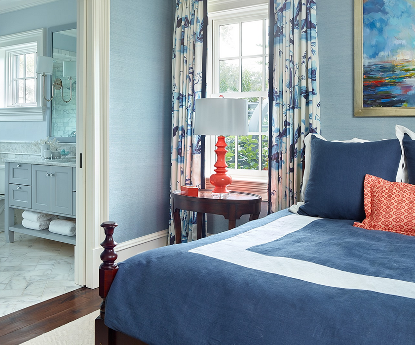
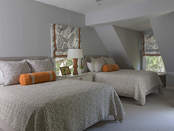
Tangerine is always a welcome addition to grey and white tones. If you want more visual energy, combine tangerine tones with navy or indigo.
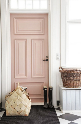
Pink
Some shades of pink and rose can be incredibly dramatic when paired with chalky whites and greys. (We love Pink Ground by Farrow and Ball.)
Reupholster a side chair in raspberry or peony for a romantic spot of color.
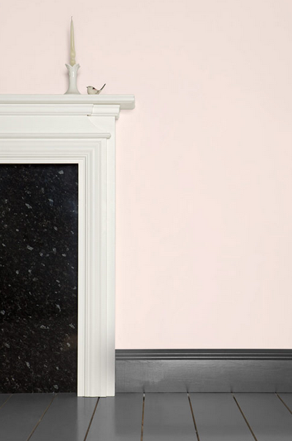
If you love ballet or blush pink, don’t be shy. This warm color adds elegance to dining rooms, master bedrooms, and studies. Keep everything crisp and modern by using white or neutral accessories. Middleton Pink is a barely-there shade by Farrow and Ball that captures warm light perfectly.
We’re loving the warmer trends this year, especially since we were all inspired by Alexis’s trip to India. If you’re ready for a spring or summer refresh, keep your backdrops neutral and cool, then add your favorite punchy accessories