
A Warm Coastal Color Palette
May 10, 2016
If you’ve lived on the coast for any length of time, you may be yearning for color palette that transcends traditional navy blue and white. A warm coastal color palette, inspired by natures hidden details, may be just what the designer ordered.
In Charleston, we’re often inspired by the blue of the Atlantic, the spring greens of the marsh and the sandy browns of our beaches. It’s a wonderful palette, but if you look a little closer at the natural environment you’ll spot small or temporary splashes of tropical color everywhere. Need inspiration? The front garden is the best place to start.
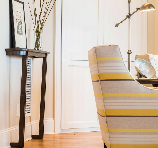
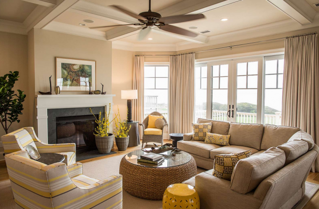
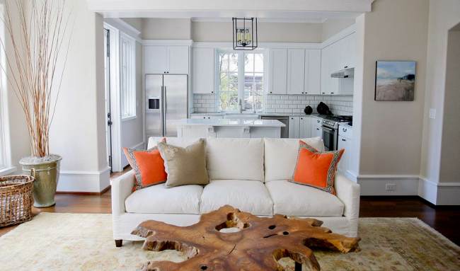
In our Turtle Shore home we liberally used lemony yellows to warm up a calm, neutral color scheme. We like to take our cues from Mother Nature, and bright yellow echos the Meyer lemon trees and moonbeam coreopsis that grow year round in the Lowcountry.
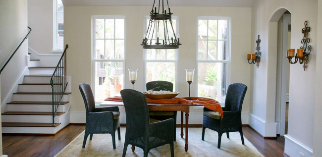
In Margaret’s house, she uses raspberry and persimmon to spice up her harbor front living room and dining room. Oranges and reds reflect our dramatic Charleston sunsets and the Indian Blanket gaillardia that grows wild on our sand dunes.
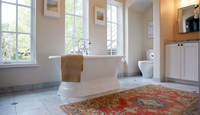
One of our favorite uses of persimmon to warm up a cool palette is in our Cypress Point home. This white, beige and black color scheme will stay sophisticated forever, but the use of soft orange and squash yellow in the rugs, pillows and throws adds personality and exotic spice.
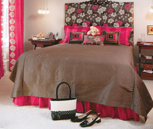
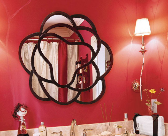
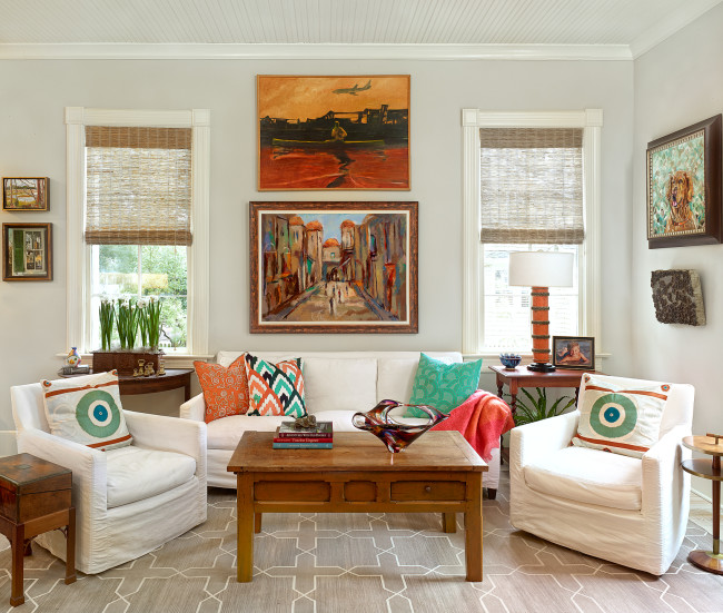
We really turned up the heat in our Southern Living Idea House with the use of drift rose red and geranium hot pink. While the rest of the house featured plenty of turquoise and green, these warm colors lend a feminine distinction and elegance.