
Pantone Color of the Year 2022
August 4, 2022

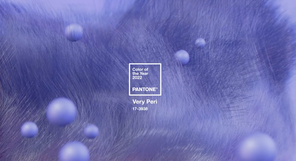
Every year Pantone, a color industry standard, announces a Color of the Year. This year, they have chosen Very Peri (Pantone 17-3938), a color belonging to the blue family with violet undertones.
Founded in the 1950s and headquartered in New Jersey, Pantone is one of the biggest names in the design and printing industries. It is best known for its Pantone Matching System, which spans both digital and printed color and allows designers to match specific colors, regardless of how the color is produced.
The Color of the Year selection process is not taken lightly. The company hosts a two-day summit at an undisclosed location with color representatives from all over the world. After intense discussions and debate, a color is chosen that is relevant to the times and the perceived needs of the world.
“The Pantone Color of the Year reflects what is taking place in our global culture, expressing what people are looking for that color can hope to answer. Creating a new color for the first time in the history of our Pantone Color of the Year educational program reflects the global innovation and transformation taking place. As society continues to recognize color as a critical form of communication, and a way to express and affect ideas and emotions and engage and connect, the complexity of this new red violet infused blue hue highlights the expansive possibilities that lay before us.” – Laurie Pressman, Vice President of the Pantone Color Institute.


Very Peri somehow instills a sense of calm while also encouraging ingenuity and creativity. It is colorful yet natural, which makes it a perfect fit for the Lowcountry.
If you enjoy reading about Pantone’s Color of the Year and seeing the colors used in interior design, be sure to check out our posts about the 2021 and 2020 selections!